Su Casa Memphis Website
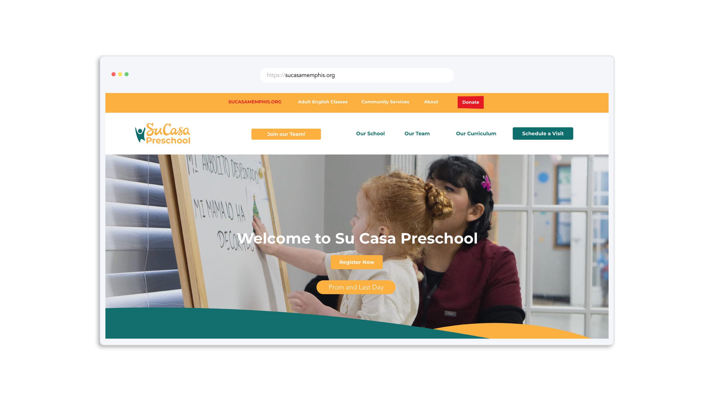
As the in-house designer for Su Casa Memphis, I led a full website redesign to better reflect our mission. Although we served the Hispanic community, the former site was only in English and lacked the warmth and organic feel we wanted to convey. The project involved not only creating a visually inviting, bilingual site but also optimizing SEO to expand our reach. I’m proud of how it turned out and grateful to my team for trusting me with such a significant project.
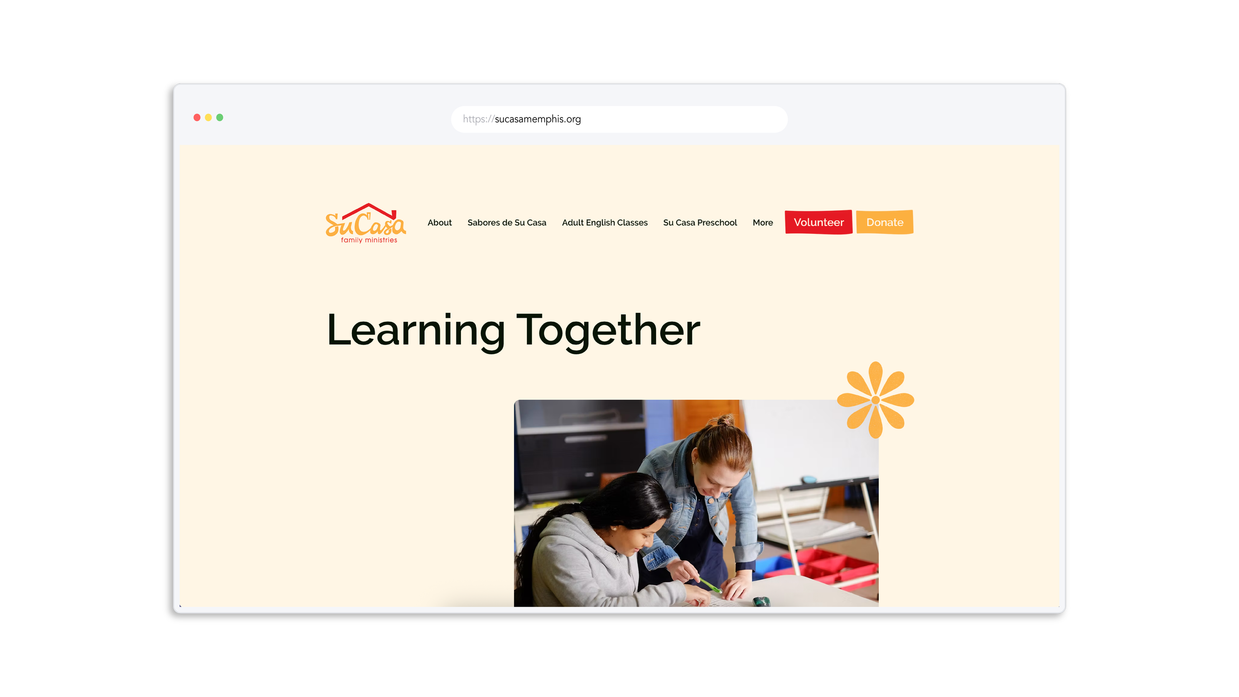
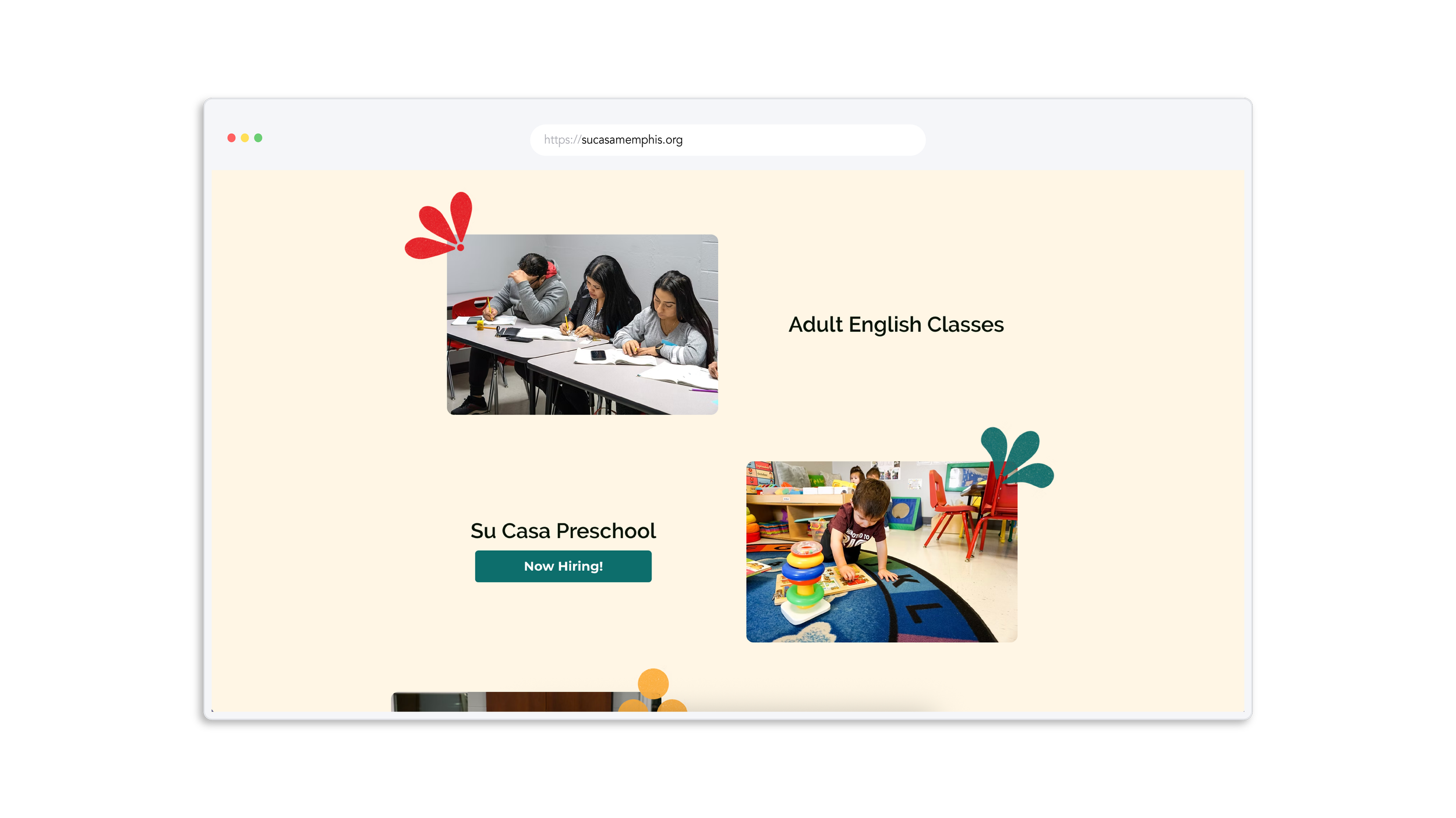
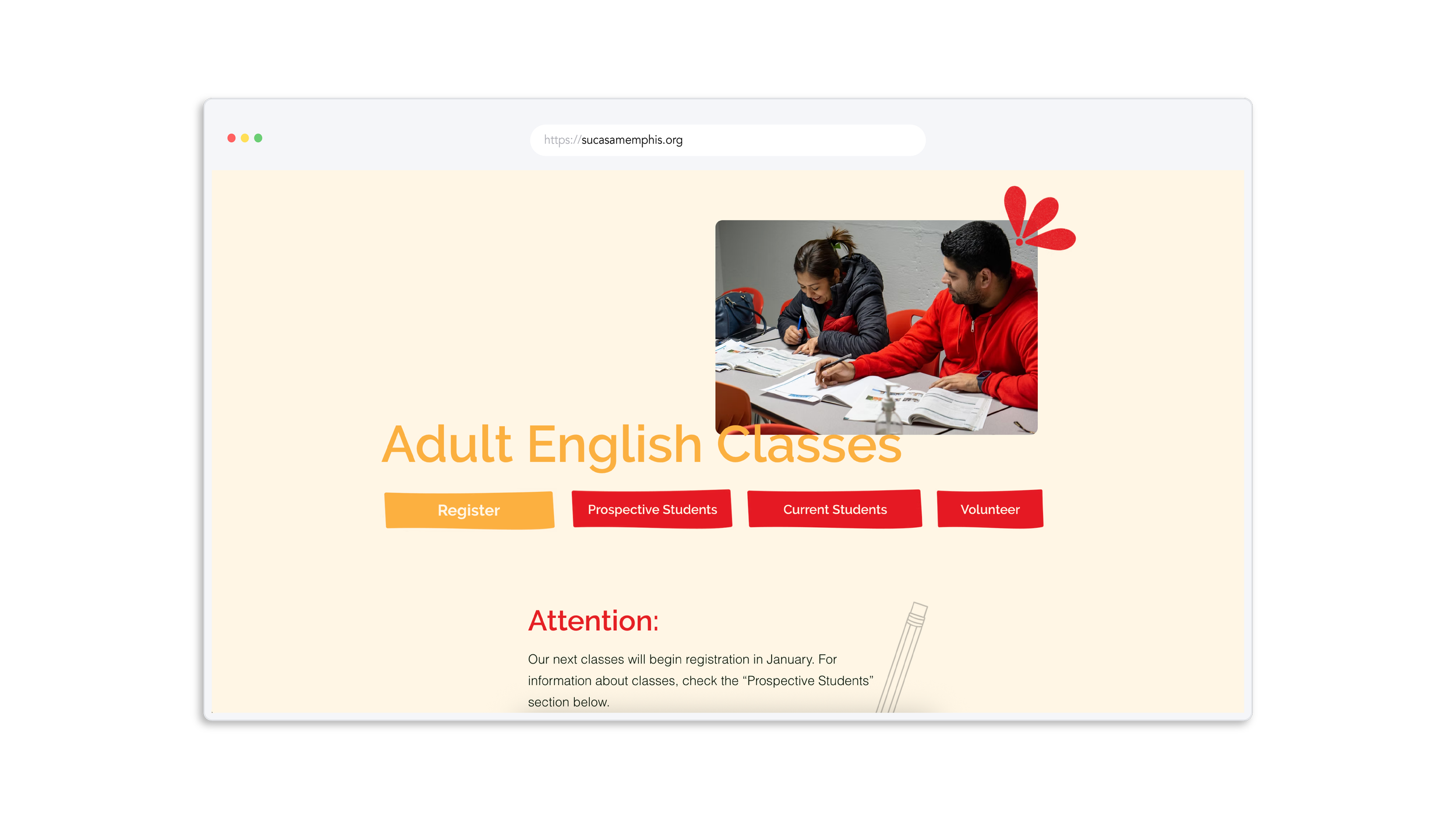
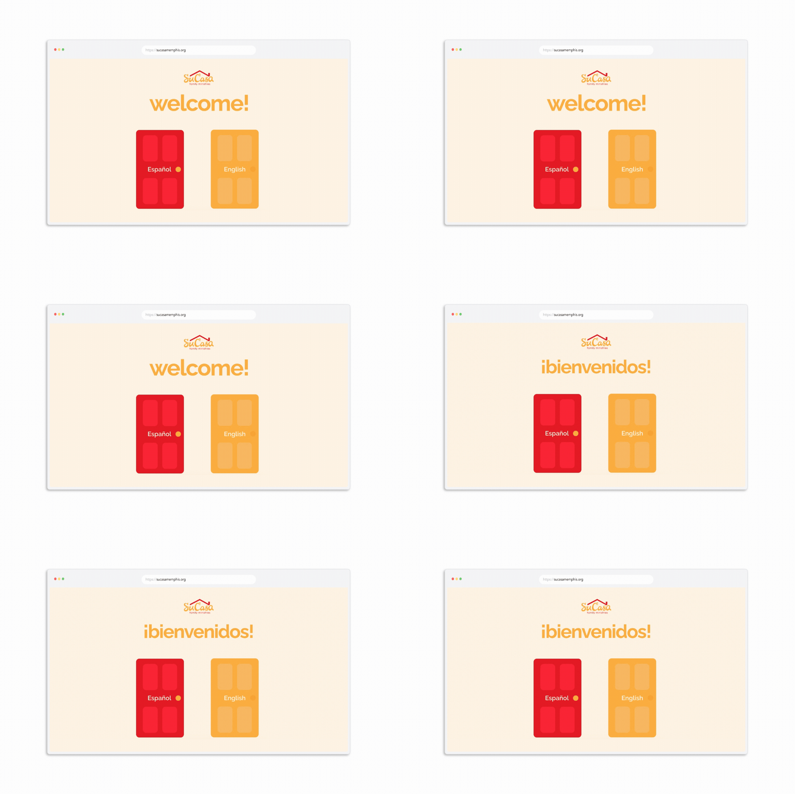
One of the biggest challenges was creating a fully bilingual website. We chose not to rely on Google Translate, since the results often felt impersonal and inaccurate. Because our primary audience is the Hispanic community, it was important to show that we invested the time and care to create a site that truly worked for them. To avoid cluttering pages with dual-language copy, I designed a Spanish version of the site, introduced by a splash page that allowed visitors to easily choose their preferred language.
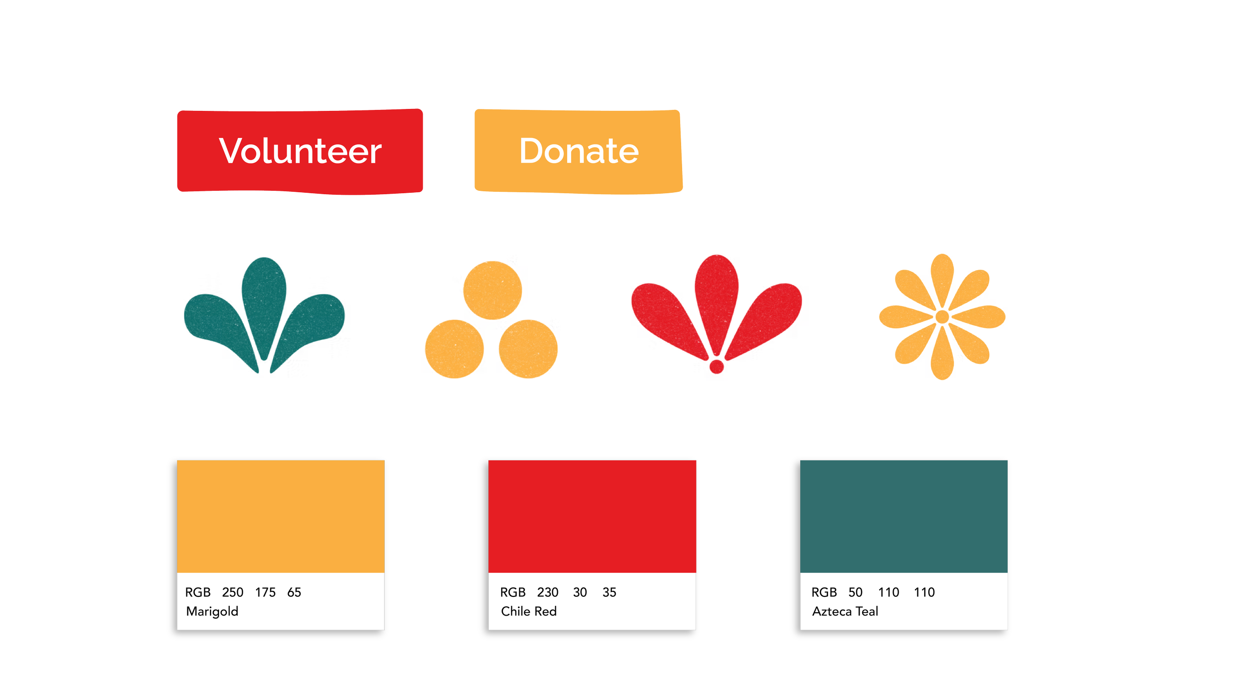
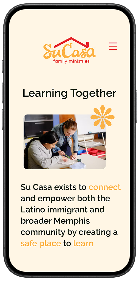
To convey warmth throughout the site, I chose a soft off-white background paired with Su Casa’s classic red and yellow. Teal served as an accent and later became a signature color for our preschool. I also created hand-drawn elements inspired by Spanish tiles and papel picado, while designing buttons with an organic, approachable feel.
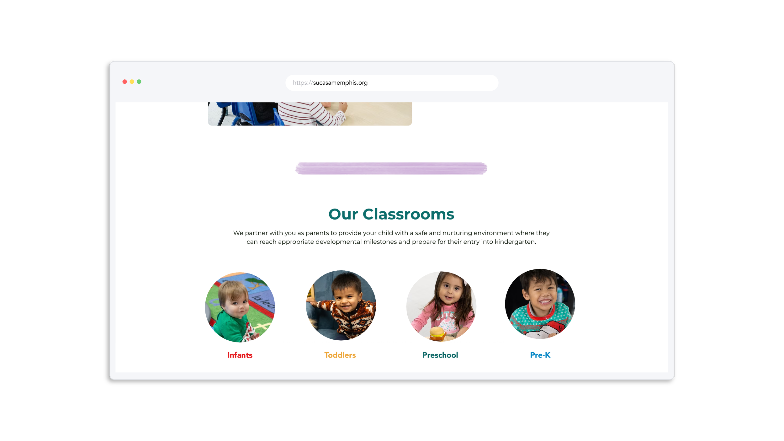
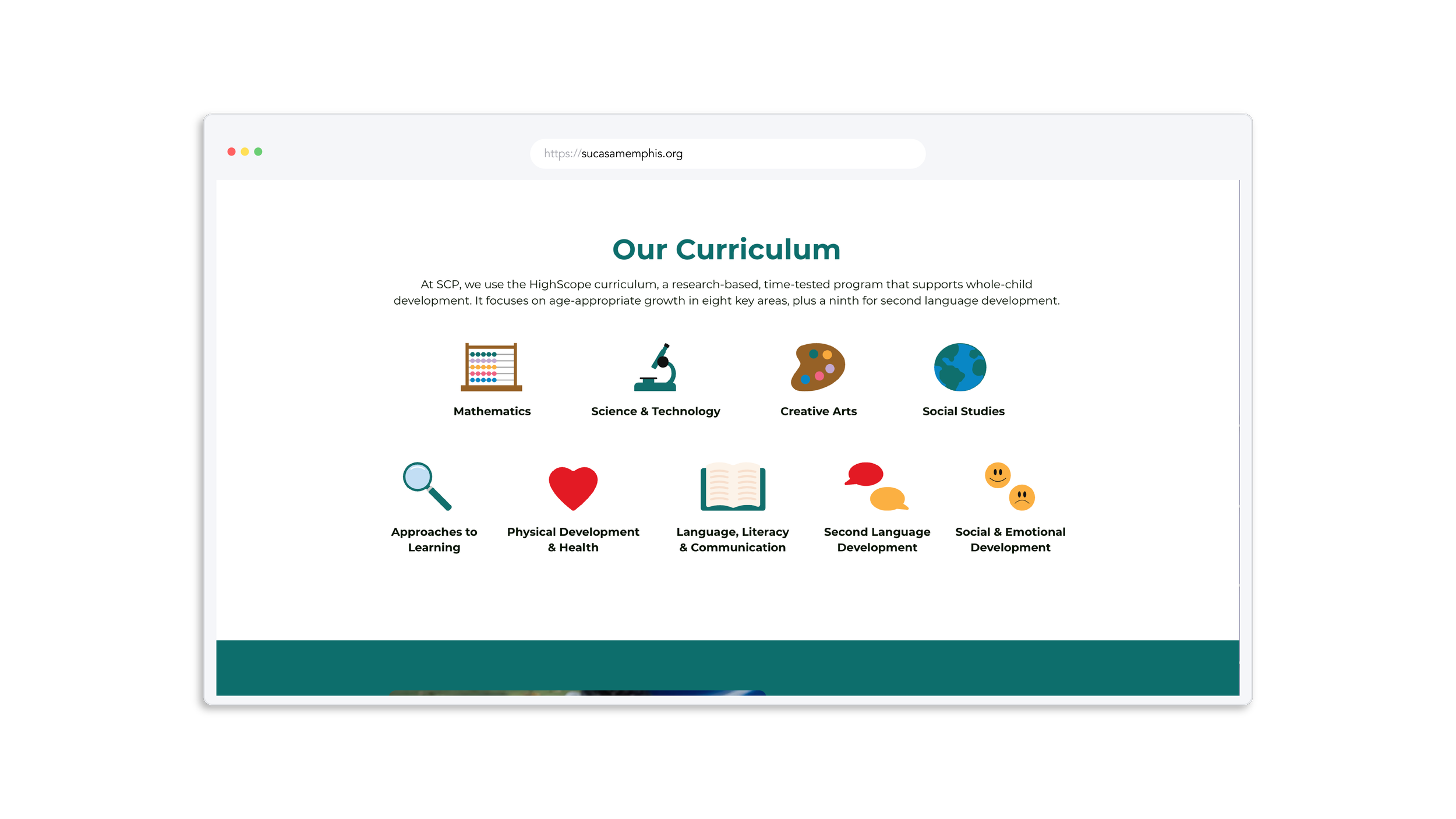
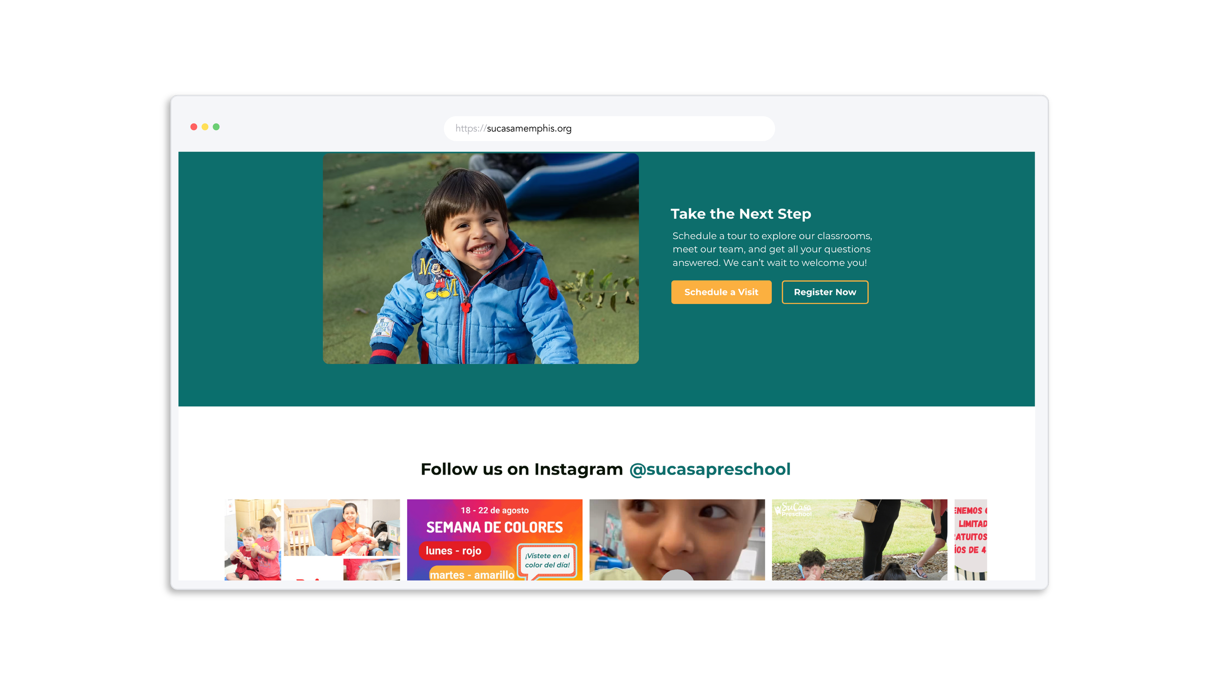
A few years after the redesign, our preschool transitioned into a full-time program, which required a dedicated page that felt distinct yet still connected to the Su Casa site. To communicate the large amount of information clearly, I designed the page with a look that was both colorful and clean.